The Risk Category Report breaks your risk down by category rather than showing it as a single overall figure, or with the individual risks as they are covered on the risk register. It matters because "our risk is elevated" is rarely an actionable statement, whereas "our risk is elevated and it is concentrated in third-party and data categories" tells your team where to spend the next quarter.
Where this sits alongside the Risk Register
Your day-to-day risk position is read from the Risk Register itself, which carries its own reporting widgets on the same page. This report is the layer above that: category-level scoring in a form suited to reporting a specific area of risk to an owner, an executive, or a board committee.
If your team previously used the Old Risk Report, this replaces it. Overall posture is now read from the Risk Register, and category-level detail from this report.
What the report shows
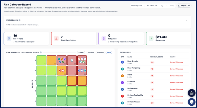
The report draws its scoring directly from the Risk Register, so it always reflects the current state of your register rather than a separate calculation. For each Risk Category you can see its score, how it compares to its tolerance, and how it has moved over the reporting period.
The mitigating controls shown reflect your current control designations. If you change which controls are designated Key or Compensating in Risk Settings, the report updates to match. See Risk Settings Overview.
The Risk Matrix
The matrix plots your risk likelihood against impact using the points set in your risk settings. Toggle between Standard View and Precise View to see current and tolerance levels at different levels of detail, add the Inherent view from the filters, and switch between Condensed and Descriptive to show or hide the Risk Category descriptions.
Risk trends over time
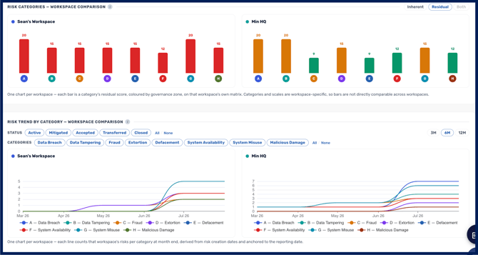
The report includes dashboards showing how each risk category has trended over time, so you can show movement rather than a single point-in-time score.
Two things govern how that history is drawn. A month in which nothing changed carries forward the previous month's value rather than showing a gap, so a flat line means a stable position rather than missing data. And historical scores are always re-plotted through your current risk matrix rather than the matrix in force at the time, so the trend stays internally consistent if you resize or re-band the matrix later. The practical consequence is that changing your matrix changes the shape of your history as well as your present position.
Comparing categories
A built-in comparison tool lets you set categories side by side. This is useful when you need to justify why one area is getting investment ahead of another, or to show a committee how two parts of the business compare.
Comparing across workspaces
Workspace comparison carries across from the previous report. An expandable section at the top of the report lets you select which workspaces to include, so you can report on one part of the business or set several side by side.